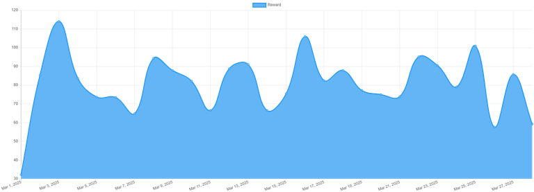
My curve looks as ugly, just the values are higher, I prefer the graph from hivestats.io which integrates other data as well
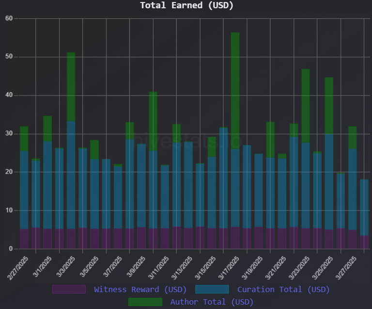
My curve looks as ugly, just the values are higher, I prefer the graph from hivestats.io which integrates other data as well