Hi everyone! 😊
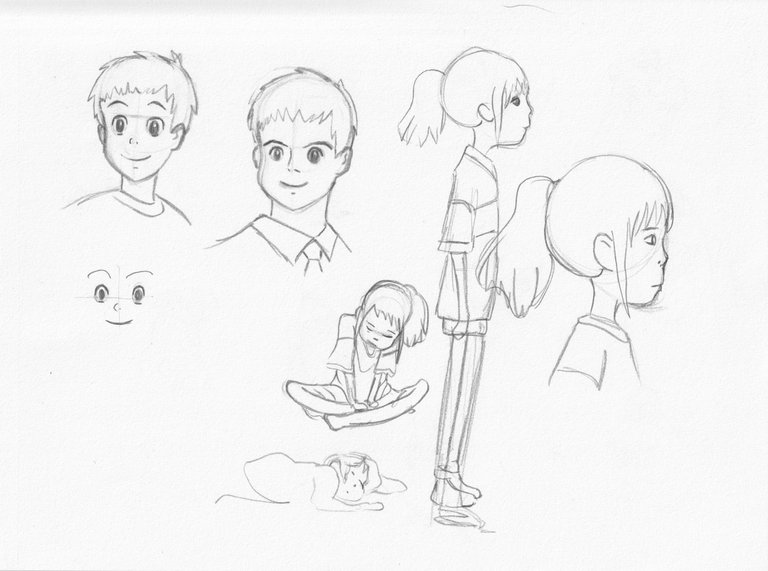
At first I wanted to focus my character design studies on Ghibli characters, but I quickly realised that they weren't as easy as they looked, it's a style in itself and the codes look quite difficult to learn.
In fact, I've never been a fan of the manga style of drawing, I've never practised its style and proportions. Maybe that's why it doesn't look familiar to me.

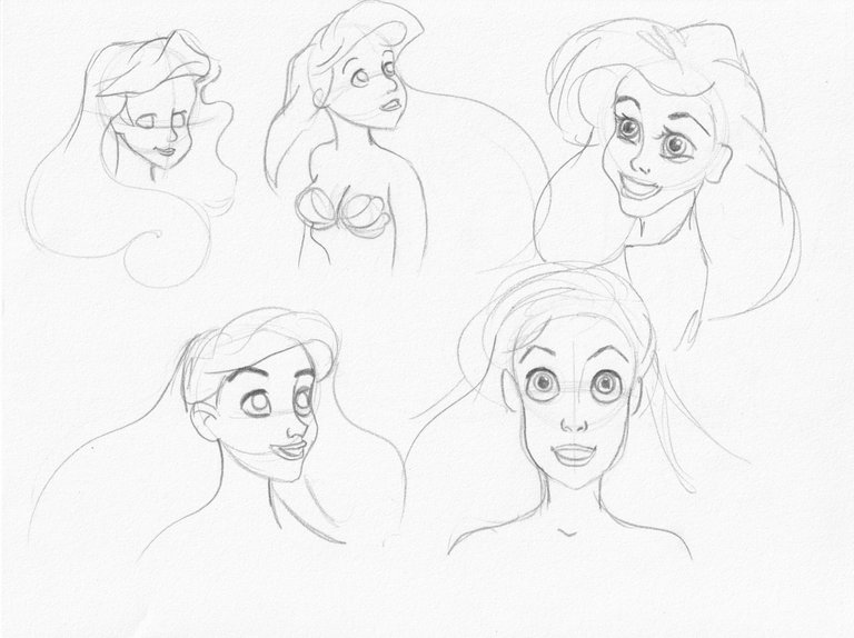
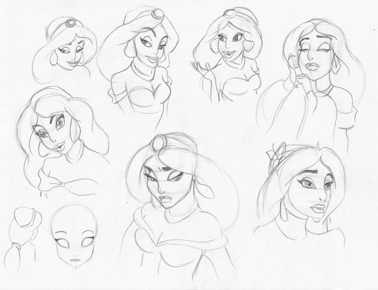
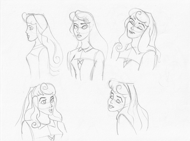
As I have encountered difficulties, I left Ghibli studies for this time and I went through Disney characters. I tried to study the female Disney archetype and the proportions of the face.

It's very precise, because if I don't get the proportions right, the result looks like a cheap counterfeit 😂


To sum up, the Disney archetype can looks like a realistically proportioned child - the eyes are large for the face compared to a real adult.
It is made for appealing, as we usually found babies cute in real life, roundness and big eyes appear to us beautiful, pleasant.
So it is a combination of children's proportions, but with adult features, that makes this look appealing and credible.

I hope you will like it 😊
See you soon for more.