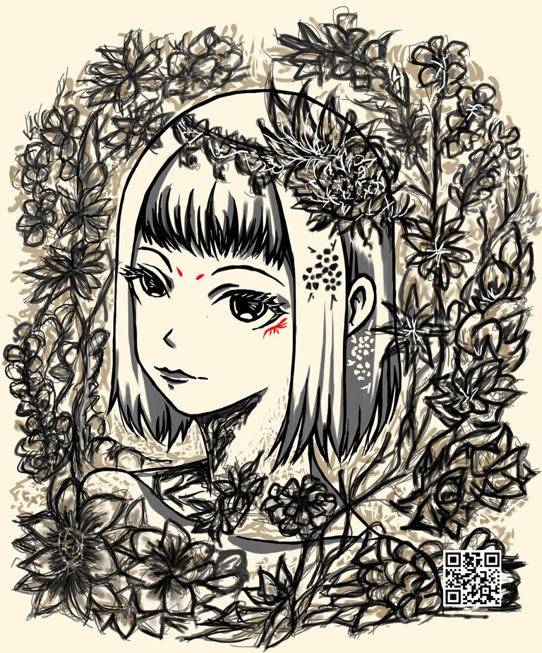
I'm planning to use the base image (girl) to other future works. The art challenge here is creating multiple art styles from the same base.
There's another process I'm still exercising which is not giving much fucks about the small details that most wouldn't really mind unless they focus as trying to get a good impression and composition first is important than working on the fine details. The fine details are important, it's just that I think composition and overall impression takes higher priority because no matter good the smaller details look, if the overall impression and composition is bad, the piece doesn't look cohesive.
That being said, I don't think I made only average progress or a so so result here.

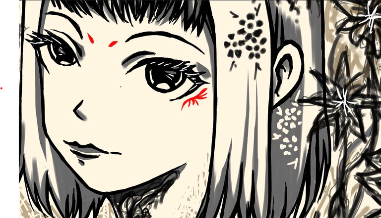
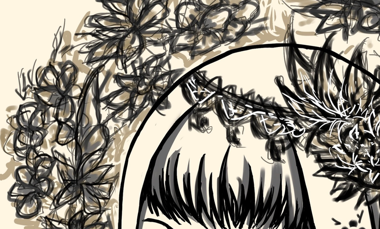
Closer look at the details.


If the image is zoomed out, those tiny imperfections become less obvious than when zoomed in. In concept, I took this idea from John Singer Sargent's painting style where the overall piece looks good from afar but closer inspection shows how distorted the brush strokes can. Something to note is the use of focal point when I want to highlight the face, it's the most sharped edged and clear portion of the piece compared to the rest of the floral patterns. This is the part where I want to guide the viewer's eyes as the other details matter less.
The QR code I use as a watermark leads to my @artofadamada account on Hive as a landing page whenever I share my work across other social media. I doubt I'd get a significant reach as I am now but if I can get more people curious about where that QR code leads, hopefully it converts to more sign ups on the platform.
My other social media pages: DeviantArt, Instagram, X

