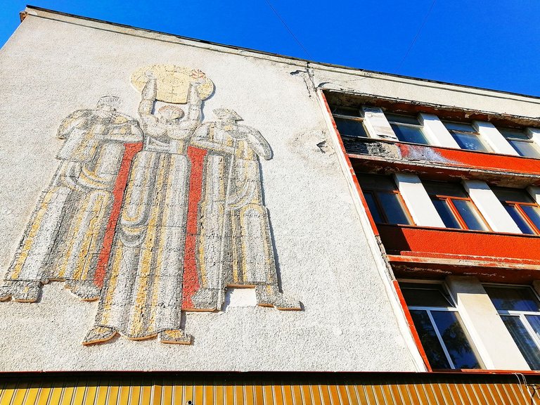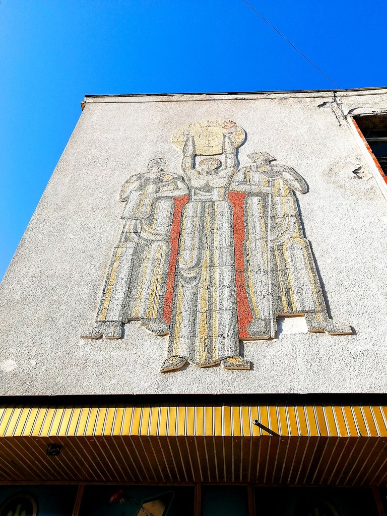
In fact, it is already noticeable in the previous post, but maybe not at first glance, maybe the gaze should be directed there on purpose. Because the first thing that strikes me, at least to me, is the shape, the specific geometry of the building. Then maybe it's the lack of maintenance that is visible in these photos as well. And only then comes the decoration.

Now, looking at this mosaic placed at this height, I mostly wonder how it was placed there, not why it is not maintained nowadays. Nowadays, nothing is maintained, especially such buildings that were once government property, nowadays it is not clear whose property they are, and also it is not clear who is responsible for their maintenance. And as it is clear that all tenants do not care what conditions they work in, because here it's just like that. But how was this decoration put up there years ago? That's the interesting thing.
And the other thing that comes to mind now is that this was the way to diversify the boring geometric shapes of the past. What do you think?
Copyright: @soulsdetour
 | Soul's Detour is a project started by me years ago when I had a blog about historical and not so popular tourist destinations in Eastern Belgium, West Germany and Luxembourg. Nowadays, this blog no longer exists, but I'm still here - passionate about architecture, art and mysteries and eager to share my discoveries and point of view with you. |
